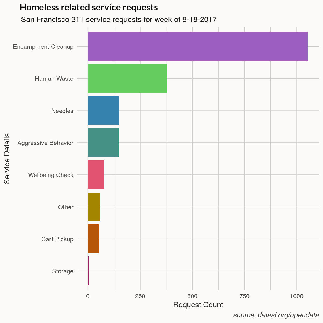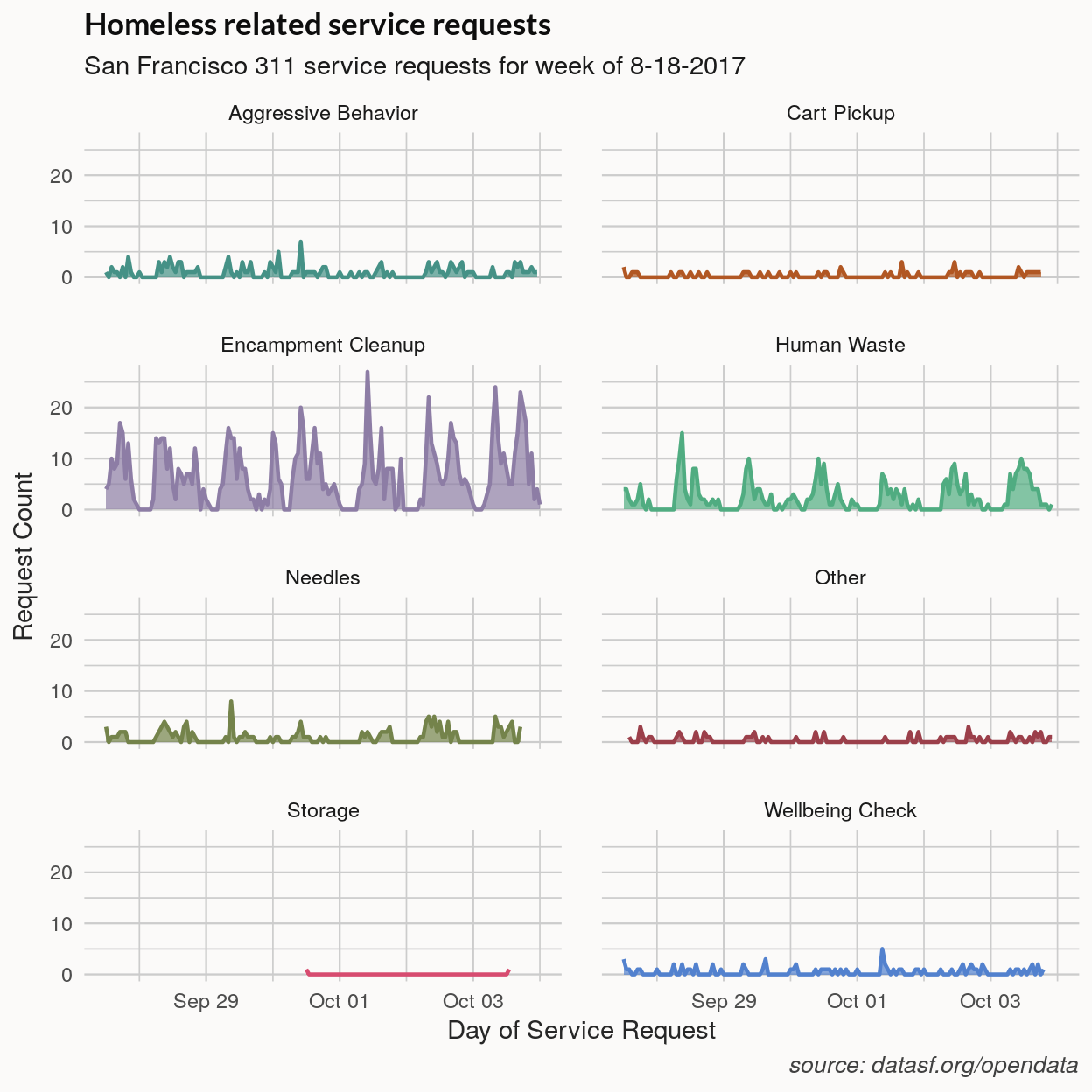
In this post I create an interactive map of the San Francisco 311 service requests related to San Francisco’s homeless residents. To make the maps I use the R leaflet package which provides an R interface to the interactive Javascript mapping library of the same name. The data are available through San Francisco’s open data portal, DataSF, which is powered by a Socrata backend. I use two packages, RSocrata and soql, to simplify the process of querying Socrata API.
I have wanted to look at the SF data for awhile but this exercise was also an excuse to see how some of the Rmarkdown htmlwidgets worked with the blogdown package and Hugo, which are used to make this blog. There were a couple of problems rendering leaflet maps and the DT datatable but these were solved using the widgetframe package that wraps interactive htmlwidgets in an iframe. You can jump to the bottom to see code for making htmlwidgets work with Hugo. The package is not on CRAN so you’ll need to install it with with devtools.
SF 311 service request data
San Francisco’s 311 service line and application receives non-emergency requests and comments for everything from complaints about MUNI to reporting graffiti or broken street lights. I’m going to take a quick overview of the top 311 service requests categories and then I’ll map a week of the homeless related subset of this data. To preview the dataset and for more information and links to the API URL, see this DataSF page.
Querying the SODA API
The Rsocrata package provides functions for both querying and loading data using the SODA API. Like other REST API’s, the resource – in this case the data we want – is retrieved by HTTP methods(e.g. GET) and a string that identifies the resource is formatted as a URL. The RSocrata read.socrata function handles the HTTP request and returns the data as a dataframe with POSIX formatted dates.
For doing something other than downloading the complete dataset we need to build an SoQL query. The soql package simplifies this step by providing functions for forming basic select queries. The following soql functions perform the SQL or dplyr like actions of selecting, filtering and sorting:
soql_select,soql_where, soql_order, soql_simple_filter.
There are also a few API specific commands. soql_add_endpoint adds the base API URL for a particular dataset or resource. The soql_limit and soql_offset are used for paging requests, that is, grabbing the result in batches of size equal to ‘limit’ and starting at the result array position ‘offset’. The default limit is 50,000 with offset 0. For details or to see the Socrata API guide.
If you need to make a higher volume of API calls you can register for an application token. You don’t need one, however, to get started using the API.
I have already browsed the data some so for this call I narrow down the columns to those we’ll be using. The ‘service_name’ column is the primary service category and ‘service details’ column is the name of request sub categories. Limiting the time period to (today - a week) resulted in around 10-15,000 requests across all service types.
library(dplyr)
library(ggplot2)
library(leaflet)
library(soql)
# library(Rscorata)
# library(readr)
# library(DT)
# devtools::install_github('bhaskarvk/widgetframe')
# library(widgetframes)

# The API endpoint
api_url <- "https://data.sfgov.org/resource/ktji-gk7t.json"

query <- soql() %>%
         soql_add_endpoint(api_url) %>%
         soql_limit(20000) %>%
         soql_select(paste(
                 "service_request_id",
                 "service_details",
                 "service_name",
                 "supervisor_district",
                 "requested_datetime",
                 "closed_date",
                 "lat",
                 "long",
                 sep = ","
                 )) %>%
         soql_order("requested_datetime", desc=TRUE) %>%
         soql_where(paste0("requested_datetime > '",
                 Sys.Date() - 7, "T12:00:00'"))
data <- RSocrata::read.socrata(query)
Frequent service requests
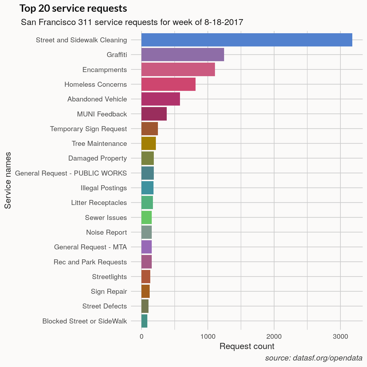
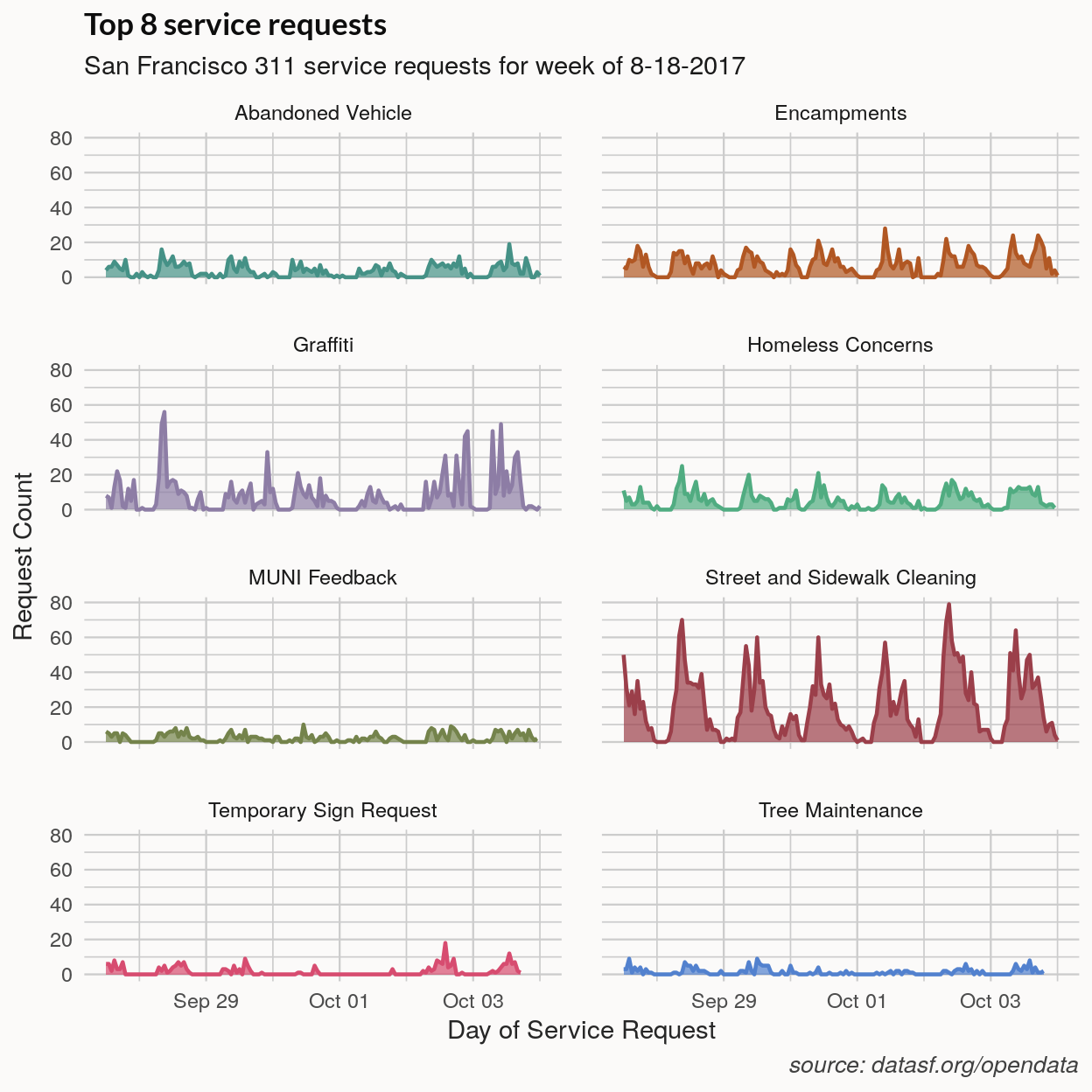
The top request categories are plotted below. The ‘Encampments’ category is separate from the ‘Homeless Concerns’ category but combined they would be the second largest category after ‘Street and Sidewalk Cleaning’.
The daily pattern of requests can be made out in the time series of the top 8 categories below. The drop in MUNI feedback coincides with the weekend. I don’t reproduce the plot here but plotting multiple week requests binned by day show spikes on weekday mornings with request tailing off by night and lower volumes on weekends, at least for the high volume service request categories.
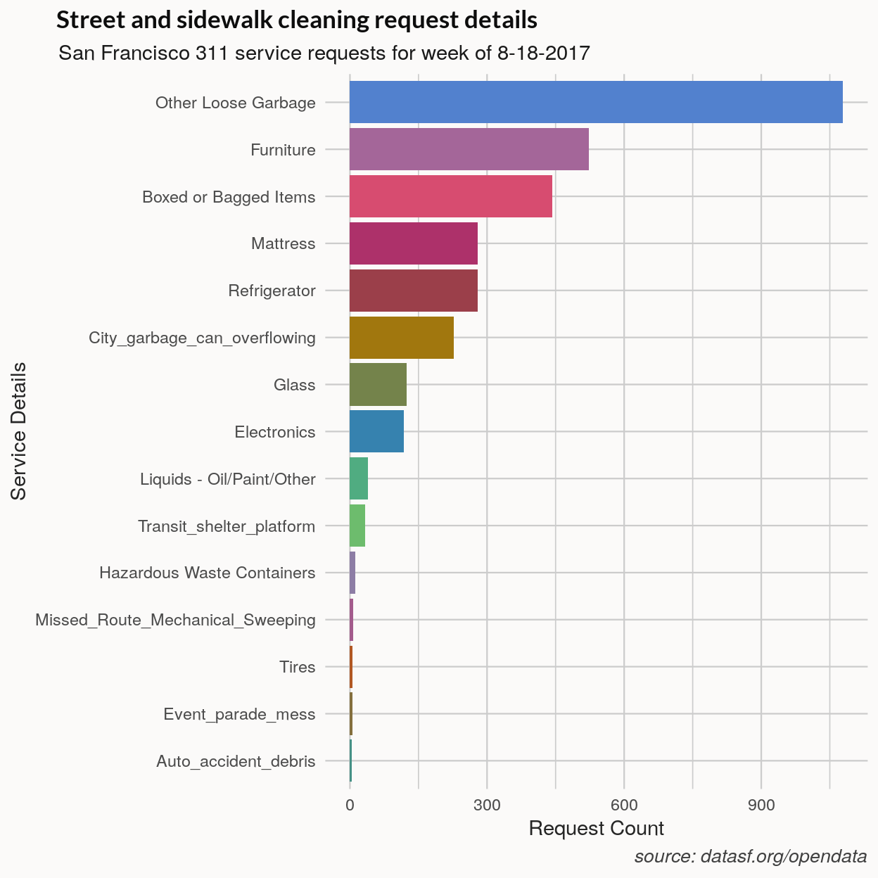
 A break down the street cleaning category shows that it’s mostly trash and dumping cleanup requests.
If you think of the top service categories – street cleaning, abandoned vehicles, graffiti, and some of the homeless related sub categories – these can be classed as requests to clean stuff up.
Mapping the data
Now I’ll map the details from the homeless related categories. The way maps are made with the leaflet package is somewhat to the way a ggplot is made by adding layers. It also should be familiar to anyone who has used the ggmap package. The base leaflet() function takes the data and additional layers – tiles, polygons or markers – can be added.
The setView function takes a center point and fitBounds takes the bounding longitude and latitude of the map. The ~ character can be used to reference objects in the data argument passed to the leaflet function. The default addTiles() function adds OpenStreetMap tiles and other tiles can be added using addProviderTiles. The demo of available leaflet providers can be found here. Adding map markers or ‘circle markers’ is mostly straightforward, although I mention one hitch below.
RStudio has a thorough introduction to the package and reading the map widget page is a good place if you want to understand the map options in more detail.
# Get data from gist
data_url <- "https://git.io/v5IJV"
pit_stops <- readr::read_csv(url(data_url))

data$lat <- as.numeric(data$lat)
data$long <- as.numeric(data$long)
data$service_name <- as.factor(data$service_name)

# Filter data
data_hl <- data %>% filter(service_name %in%
                      c("Homeless Concerns", "Encampments"))
factpal <- colorFactor(pal8, as.factor(data_hl$service_details))

# Map center
mlong <- -122.4446
mlat  <- 37.75695

# Leaflet base map and view
m <- leaflet(data_hl,
       width = "100%",
       options = leafletOptions(minZoom = 10, maxZoom = 18)) %>%
    # fitBounds(-122.526441,37.692072,-122.36276,37.821818)
     setView(lng = mlong, lat = mlat, zoom = 13)

# Add map tiles
m <- m %>%
     addProviderTiles(providers$MtbMap) %>%
     addProviderTiles(providers$Stamen.TonerLines,
     options = providerTileOptions(opacity = 0.35)) %>%
     addProviderTiles(providers$Stamen.TonerLabels)

# Add request data
m <- m %>%
     addCircleMarkers(
       lng = ~long,
       lat = ~lat,
       popup = ~service_details,
       label = ~service_details,
       color = ~factpal(service_details),
       radius = 4,
       stroke = FALSE,
       fillOpacity = 0.7)

# Define map markers
icons <- makeAwesomeIcon(
           icon= 'star-empty',
           markerColor = 'gray',
           iconColor = 'white',
           library = 'glyphicon'
           )

# Add customized markers
m <- m %>%
     addAwesomeMarkers(
        lng = pit_stops$long,
        lat = pit_stops$lat,
        label = pit_stops$name,
        icon = icons
        )

caption <- htmltools::tags$caption(
             style = paste0(
                      'caption-side: top;',
                      'text-align: left;'),
            'SF 311 homeless related service requests, previous 7 days')

m <- m %>% addLegend(
        "bottomleft",
        pal = factpal,
        values = ~data_hl$service_details,
        title = "Request type",
        opacity = 1
        )

widgetframe::frameWidget(m, height = 600)
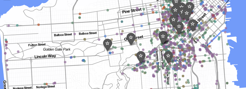
There aren’t many public restrooms in San Francisco and the Pit Stop program has added some public toilets. In addition to the homeless data, I have added markers where San Francisco has recently put some public restrooms. They seem pretty well located if encampments and waste are an indication of where they are most needed. One odd thing about them is that most aren’t available 12 or more hours a day. Most are removed for servicing over night and some close as early as 6 or 7 PM. There may be other policy reasons why they aren’t available at night but if you have 4000+ unsheltered homeless people and no public restrooms for 12 hours of the day, it seems like you can expect to find some poop on the street.
This is just one week of data and as I mentioned above the clustered sightings are likely repeated requests for the same location. Human waste sightings coincide to some degree with encampments and population density. There are some spots with encampments and few human waste sightings and a few spots, around Sacramento Street, for example, with more human waste but no encampments.
Fixing htmlwidget rendering issues
The leaflet map rendered fine until I modified the marker type which interfered with the page’s CSS for some reason. This was fixed by using the widgetframe package. The same issue solved the problems with using datatables from the DT package. In both cases, I just assigned the widget to a variable passed that to the frameWidget function.
Here is a datatable of the dataset plotted in the map above.
# Style caption
caption <- htmltools::tags$caption(
             style = paste0(
                      'caption-side: top;',
                      'text-align: left;'),
            'SF 311 homeless related service requests, previous 7 days')

dt1 <- DT::datatable(data_hl[, c(3,4,7,8)],
       # Change column names
            colnames = c("Date", "Service", "District", "Close Date"),
            height = 600,
            caption = caption) %>%
       # Format columns
       DT::formatDate(c(1,4), 'toLocaleDateString') %>%
       DT::formatStyle(1:4, `font-size`= '16px', `font-family`= 'Lato')

# Use widgetframe package to render table
widgetframe::frameWidget(dt1)