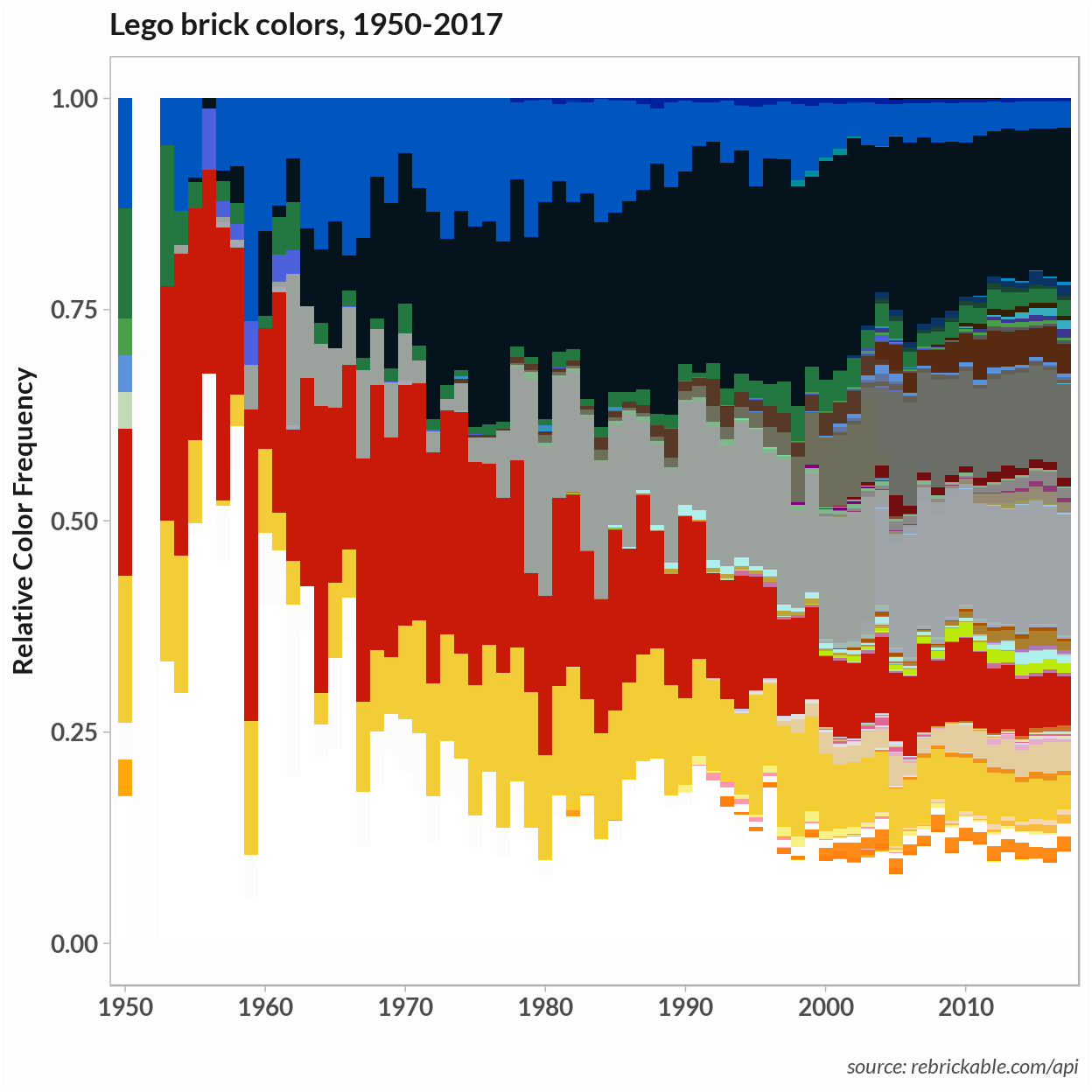
So I’m back to the LEGO dataset. In a previous post, the plot of the relative frequency of LEGO colors showed that, although there is a wide range of colors on the whole, just a few make up the majority of brick colors. This situation is similar to that encountered with texts, where common words – articles and prepositions, for example – occur frequently but those words’ meaning doesn’t add much to a (statistical) understanding of the text.
In this post, I use a few techniques associated with text mining to explore the color themes of LEGO sets. In particular, I’ll build a topic model of LEGO color themes using latent Dirichilet allocation(LDA). Like k-means clustering, the LDA model requires that the user choose the number of topics . I try out several scoring methods available in R to evaluate the best number of color themes for the LEGO ‘corpus’.
Note on code and R package shout-outs
The code for generating the analysis and plots, along with a little math background on the evaluation methods, is in this repo and this Kaggle notebook as the same analysis but run a smaller sample of sets.
One motivation for doing this analysis was to try some methods from the handy Text Mining in R book by Julia Silge and David Robinson and some of my code follows their examples. In particular, in the TF-IDF section and the analysis of the distribution of documents over the topics.
The LDA model is trained using the LDA function from the topicmodels package. Evaluation methods come from ldatuning, SpeedReader, and the clues packages. Unit plots use the waffle package.
Color TF-IDF
The LEGO dataset contains around 11,000 LEGO sets from 1950 to 2017 and the data includes the part numbers and brick colors that make up each set. Following the text mining analogy, I take LEGO sets to be the ‘documents’ that make up the LEGO ‘corpus’, and colors are the ‘words’ that make up each document or set. I ignored part numbers but it would be possible to incorporate them in a similar analysis by considering the color-part number pair as the unit of meaning.
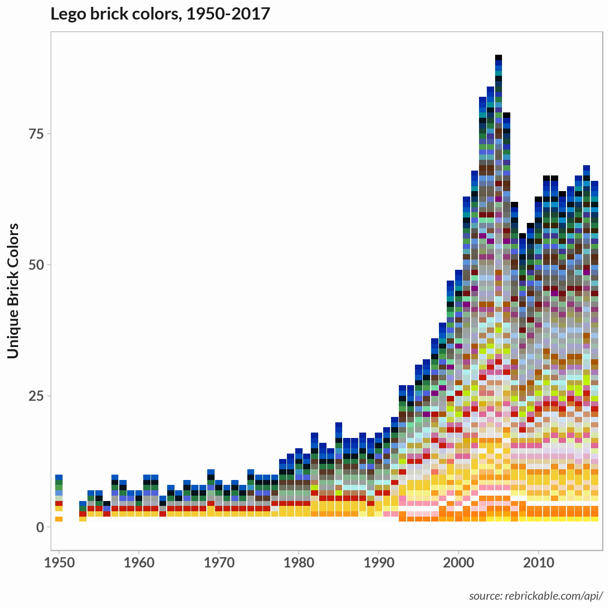
In text mining, stop words are words that occur with similar frequency in all documents. These words are often removed before performing a statistical analysis. From the frequency plot, it’s clear a few primary colors along with black, gray, and white make up the majority of brick colors. These might have been treated as stop words and removed. Our corups has a vocabulary of just 125 unique colors so I chose to leave all of them in for the analysis.
Term frequency inverse document freqeuncy(TF-IDF) is a metric of a word’s importance to a specific document. Term frequency is the frequency of a word’s appearance in each document and inverse document frequency is the count of documents the word appears in. Weighting TF by IDF means words appearing in all documents are down-weighted compared to rarely occuring words. A high TF-IDF corresponds to a color that is distinct to a LEGO set.
Low TF-IDF colors
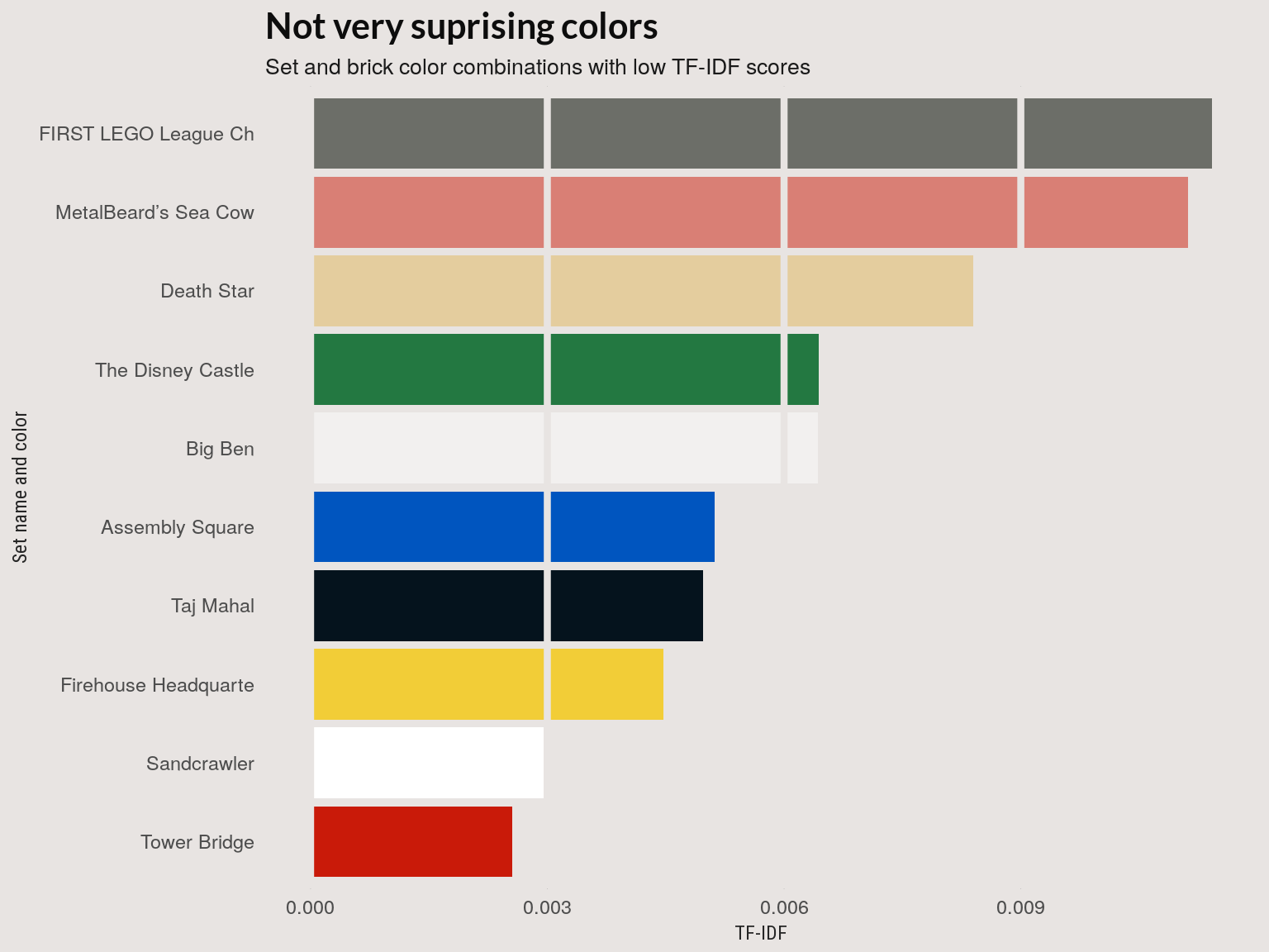
First, we’ll look at low TF-IDF colors. Many of the colors-set pairs with a low TF-IDF score show up as common colors in relative frequency plot above.
Low TF-IDF sets
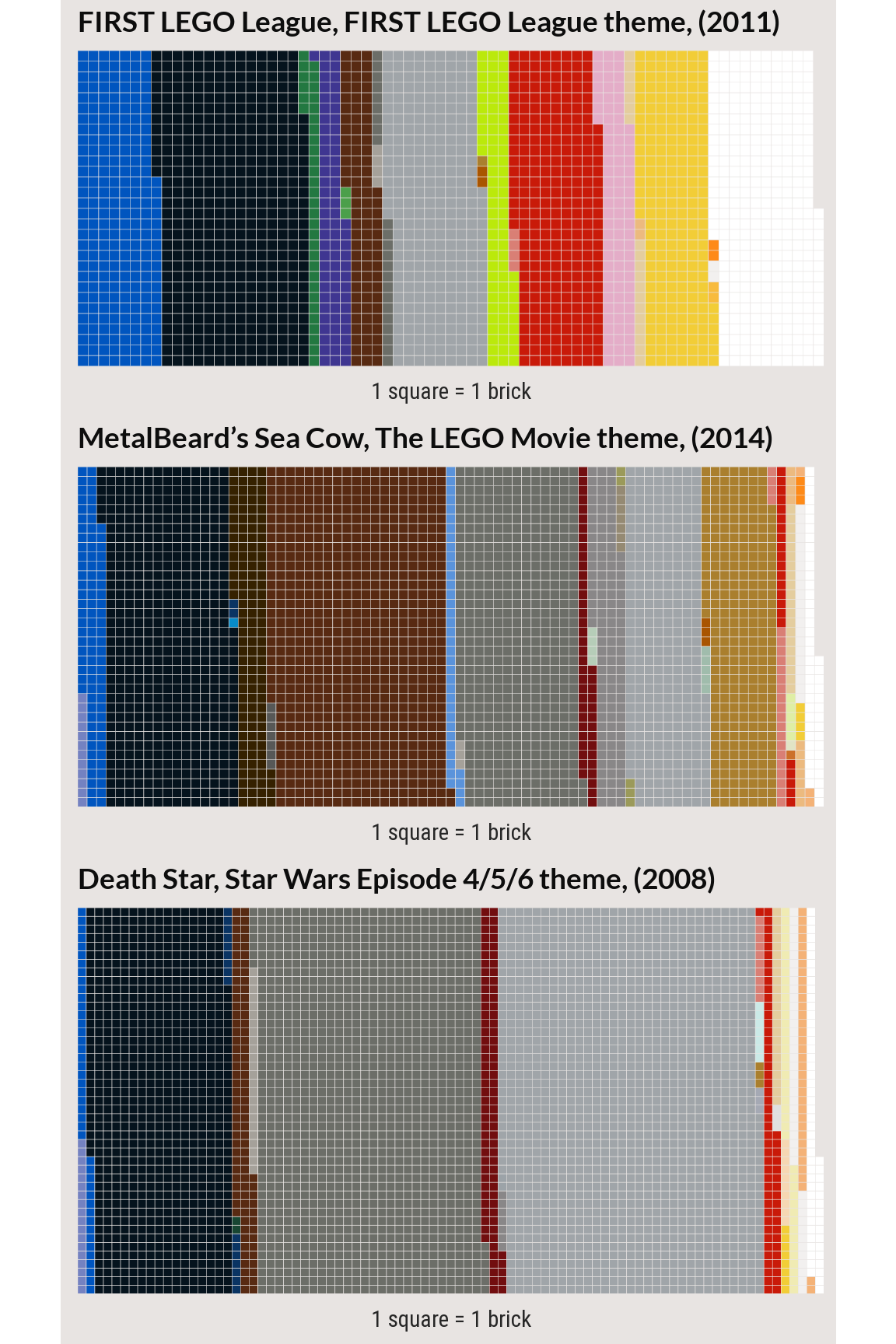
The three sets below are the 7-10th lowest TF-IDF set-color combinations. These are large sets with with a common color that appears less frequently in the set than in the corpus. For example, the darker gray in the ‘First LEGO League’ set makes up a small proportion of the set but occurs in many sets.
High TF-IDF colors
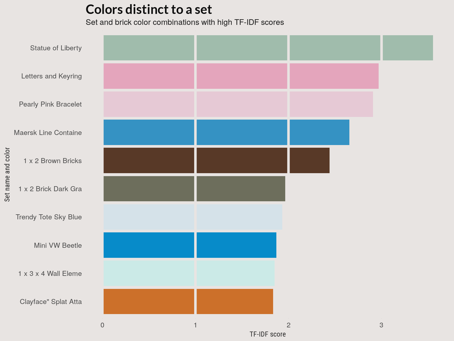
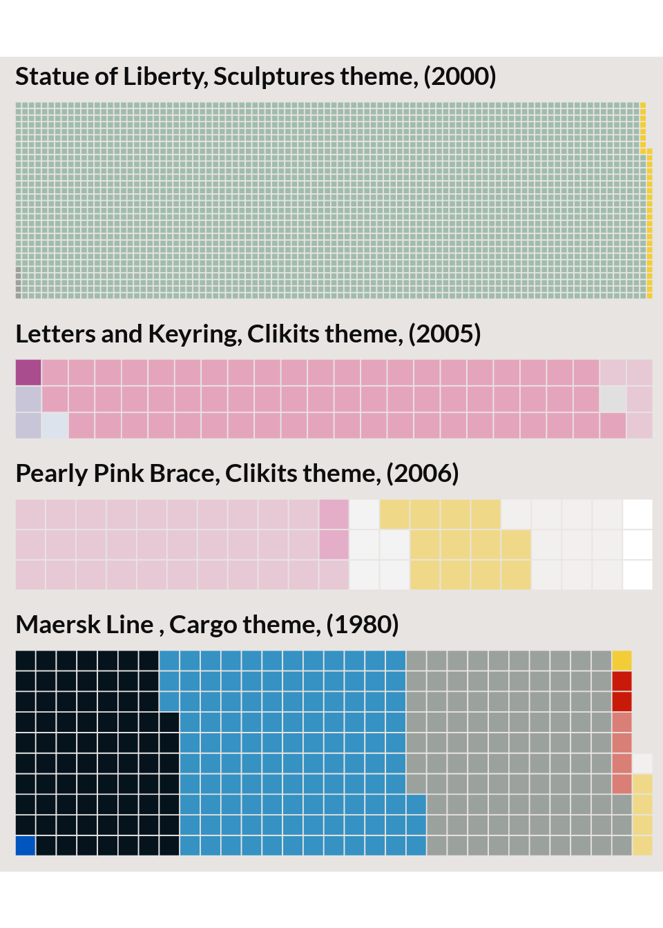
The plot below shows the 10 set-color pairs with the highest TF-IDF score. These are sets with a high proportion of the set made up of a color that shows up infrequently in LEGO sets overall. The ‘Statue of Liberty’ set is an extreme example; It’s made up almost entirely of a single sea-green color that doesn’t occur in other sets.
High TF-IDF sets
Building a topic model
After that somewhat cursory look at the LEGO sets, we’ll move on to building a topic model. The LDA model is a generative model of a body of documents (or LEGO sets or genetic markers or images). The output of the LDA algorithm is two distributions which represent the distribution of terms that make up a topic and the distribution of topics that make up a document. For our model, the term distribution is a distribution over colors that make up a color theme, while the topic distribution is a distribution of color themes that make up a LEGO set.
In this generative model, the LEGO set can be generated by one theme or many themes. Tuning the number of topics in the model changes both the number of themes a set is drawn from and the colors that make up that theme.
Evaluation methods
I used several methods (chosen because they were readily available in R packages) for evaluating the number of topics that make up the topic model. This is not meant to be an exhaustive list of automated topic evaluation methods. For gauging topic coherence, for example, the Python Gensim library has a more complete pipeline which includes options to modify segmentation, word co-occurence estimation, and scoring methods.
Cross validation on perplexity
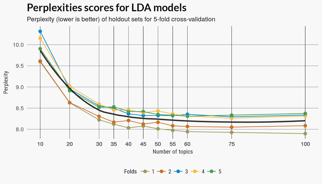
Perplexity measures the difference between distributions learned on a training and holdout set and the topicmodels package used to build the LDA model has a function for computing perplexity. This was the only evaluation methods which required cross-validation.
Topic grid
I ended up running the cross-validation twice and refined the spacing on the parameter grid to capture both the larger trend and some detail where I thought better parameters might be located. There appears to be diminishing returns to model complexity between and .
Measures on the full models
After running cross-validation on the perplexity scores I reduced the number of models for the remaining evaluation methods. The remaining methods used models trained on the full data set.
Ldatuning
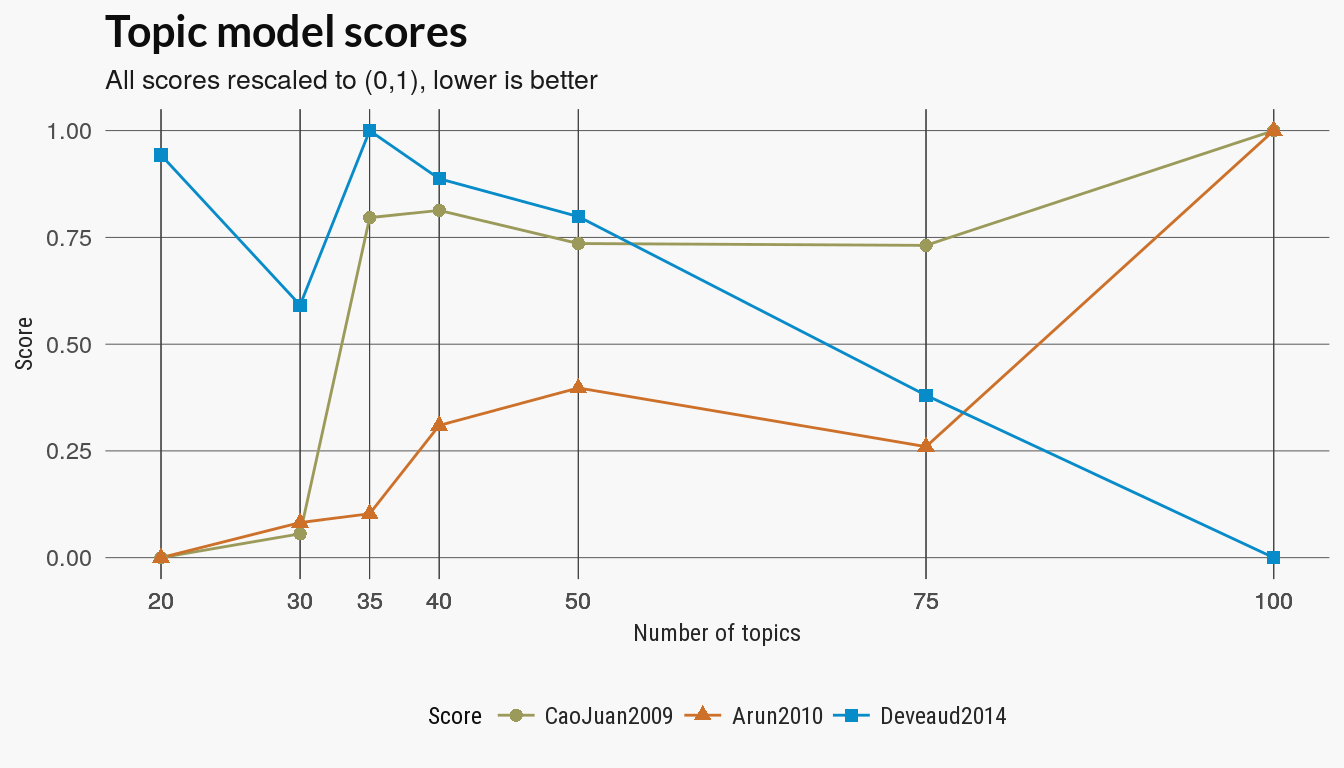
The ldatuning package has several other metrics of the quality of the topic models. The skimmed the references in the package documentation but I don’t really understand these measures. At least two of the measures agree that fewer topics are better.
Topic coherence
There are several versions of topic coherence which measure the pairwise strength of the relationship of the top terms in a topic model. Given some score, where a larger value indicates a stronger relationship between two words , a generic coherence score is the sum of the top terms in a topic model:
with top terms for each topic .
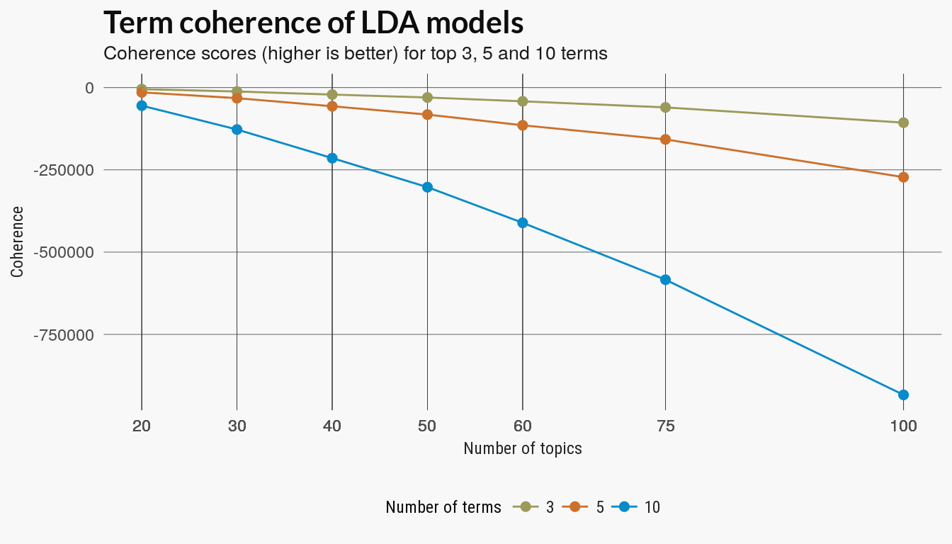
The coherence score used in the SpeedReader topic_coherence function uses the internal coherence(Umass) of the top terms. I compared the scores for the top 3, 5 and 10 terms.
External validation with cluster scoring
We can also treat the LDA models as a clustering of the LEGO sets by assign each LEGO set to the topic which makes up the highest proportion of that set, that is, the highest probability of a topic given a document We then assign a document to a cluster by taking
For comparison’s sake, I also ran a kmeans clustering using the weighted term(color) distribution for each document as the vector that representing that set.
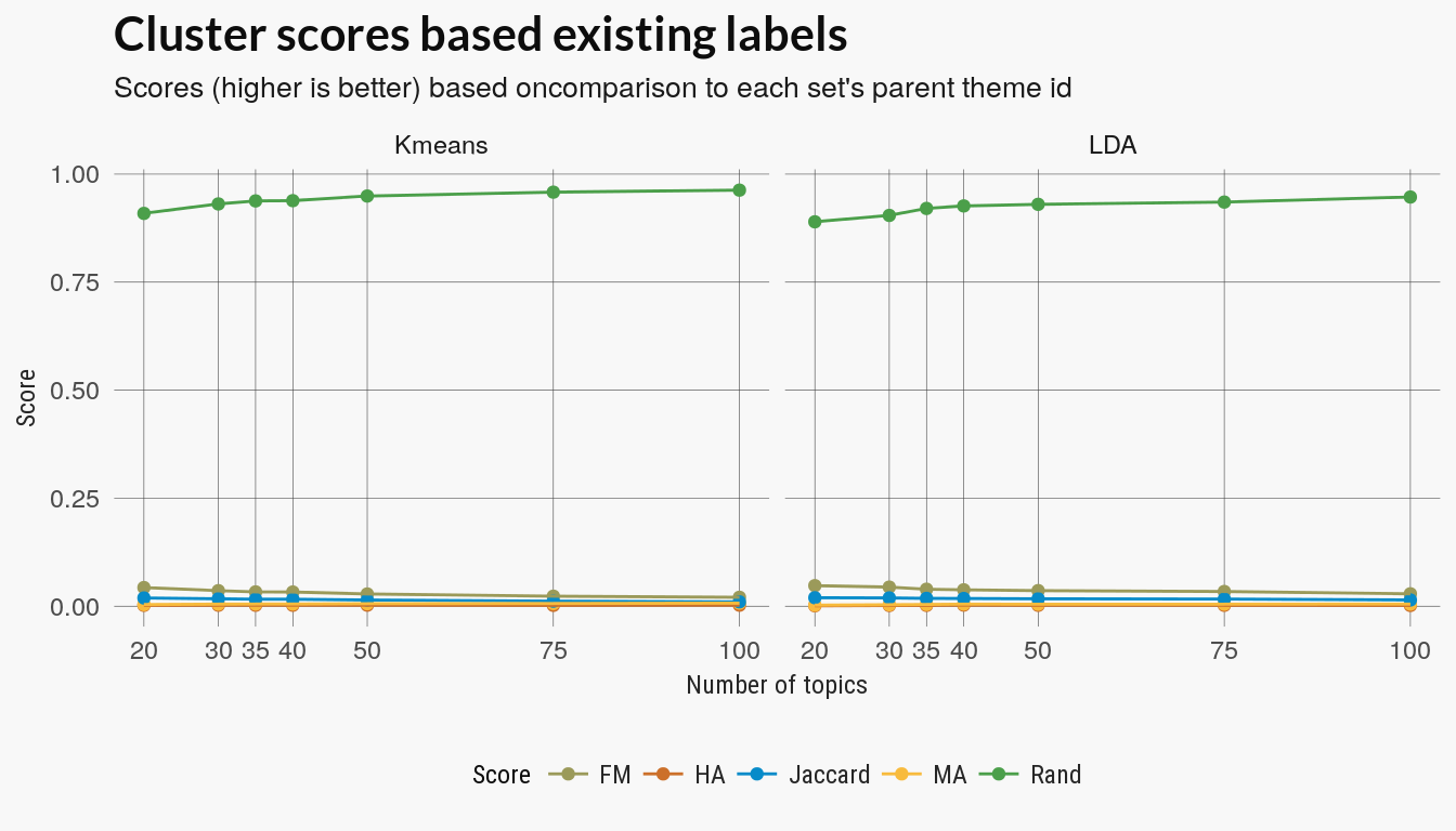
The kmeans and LDA clusterings were evaluated against each sets parent_id label which indicated the theme of the LEGO set. In total there were around 100 unique parent themes although this included sets who were ‘childless parents’.
Cluster scores
The clusters scores include Rand, adjusted Rand, Folkes-Mallow and Jaccard scores. All try to score a clustering on how well the discovered labels match the assigned parent_id. The Rand index assigns a score based on the number pairwise agreement of the cluster labels with the original labels. The other scores use a similar approach and two are versions of the Rand score but adjusted for random agreement. All scores except the un-adjusted Rand index decrease with more topics.
There’s no reason to assume that theme labels match color topics. Poking around the data indicated that some themes ids are closely associated with a palette (Duplo, for example) while other parent themes are general categories with a mix of color theme.
Topic Distribution
The last method for evaluating the learned topics is to look at how documents are distributed over the topic distributions. This example follows a this section from the tidytext mining book.
The plot below visualizes this as how the documents are distributed over the probability bins for each topic. If too many topics have sets or documents in the low probability bins then you may have too many topics, since few documents are strongly associated with any topic.
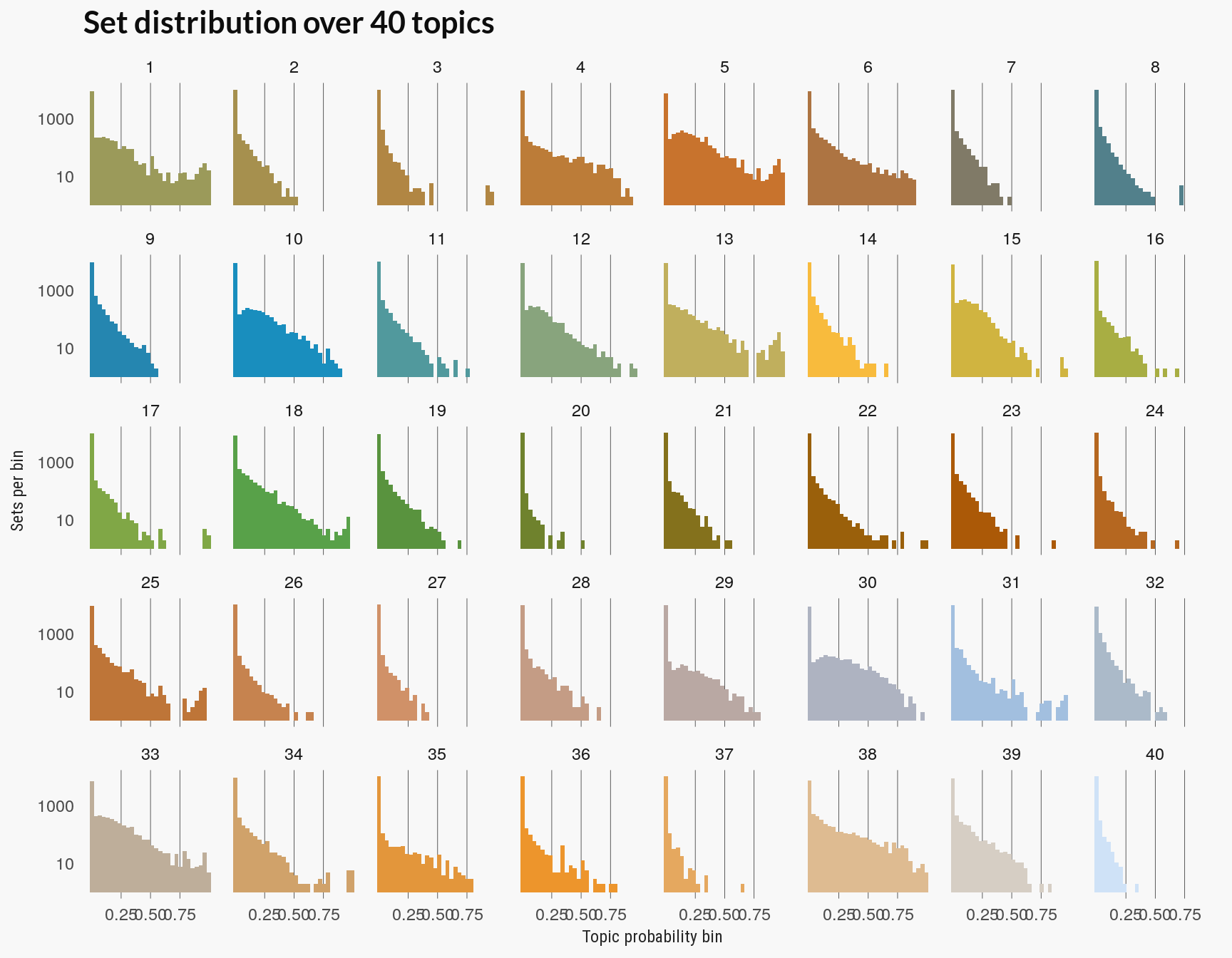
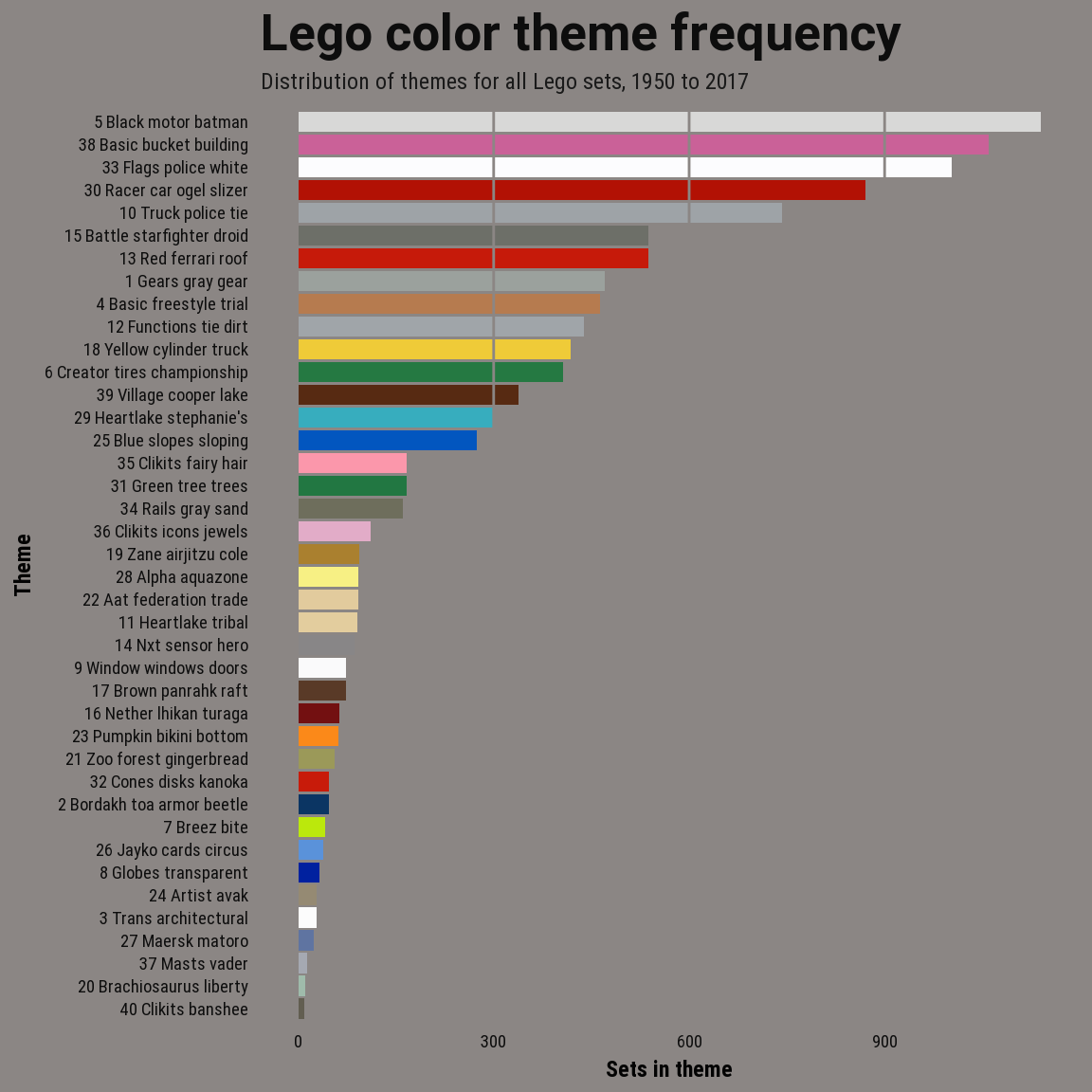
The chart above is also closely related to clustering based on LDA. If the distribution over the high probability bins of a topic is sparse then few LEGO sets would be assigned to that topic. (You can compare the plot above to the to the total distribution of LEGO sets over these topics below. Topic 40 had the fewest sets assigned to it.)
Evaluation results
None of the preceding evaluation methods seem particularly conclusive. The pattern of diminishing returns on the perplexity scores is similar to other model complexity scores and suggests a value for in the 25-35 range. This agrees somewhat with a visual evaluation of the set distribution over topic probabilities (the last chart above), where at 40 topics some topics seem to have few documents closely associated with them.
Color distributions over topics
Aside from these scoring methods, we can also plot the color distribution(or relevance) for each topic or color theme directly. Below are charts for the models with 30 and 40 topics.
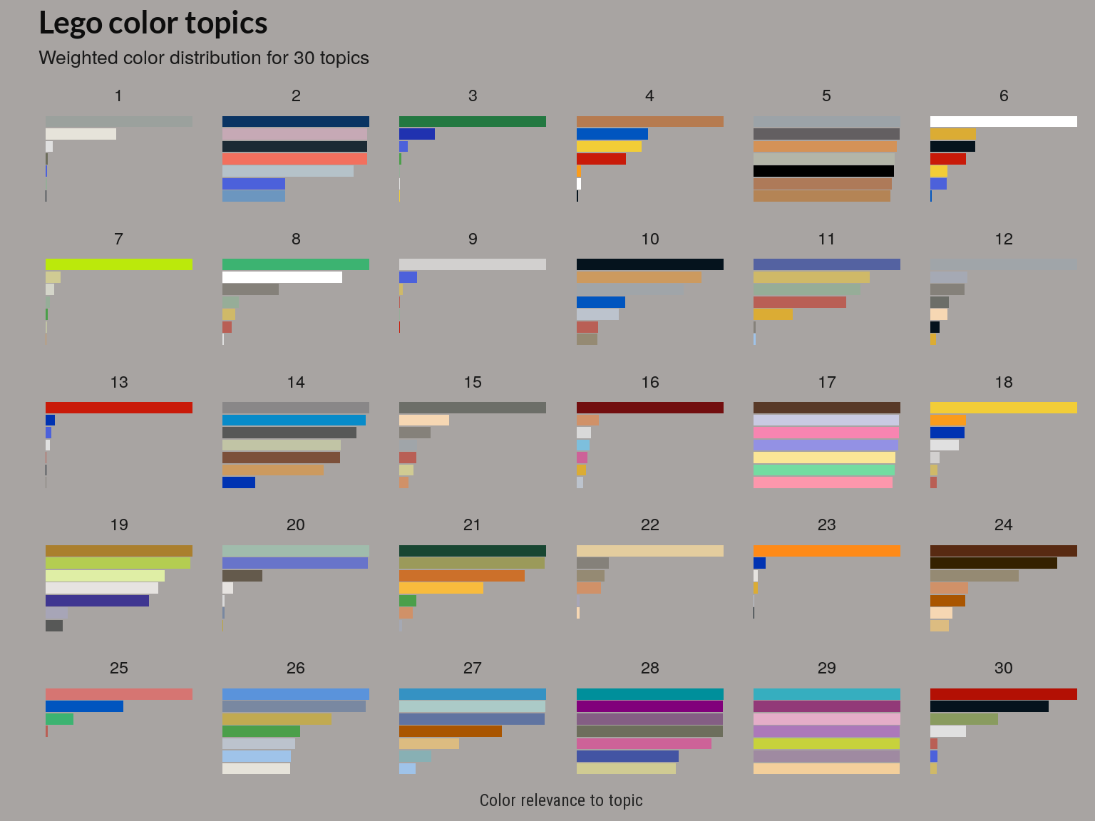
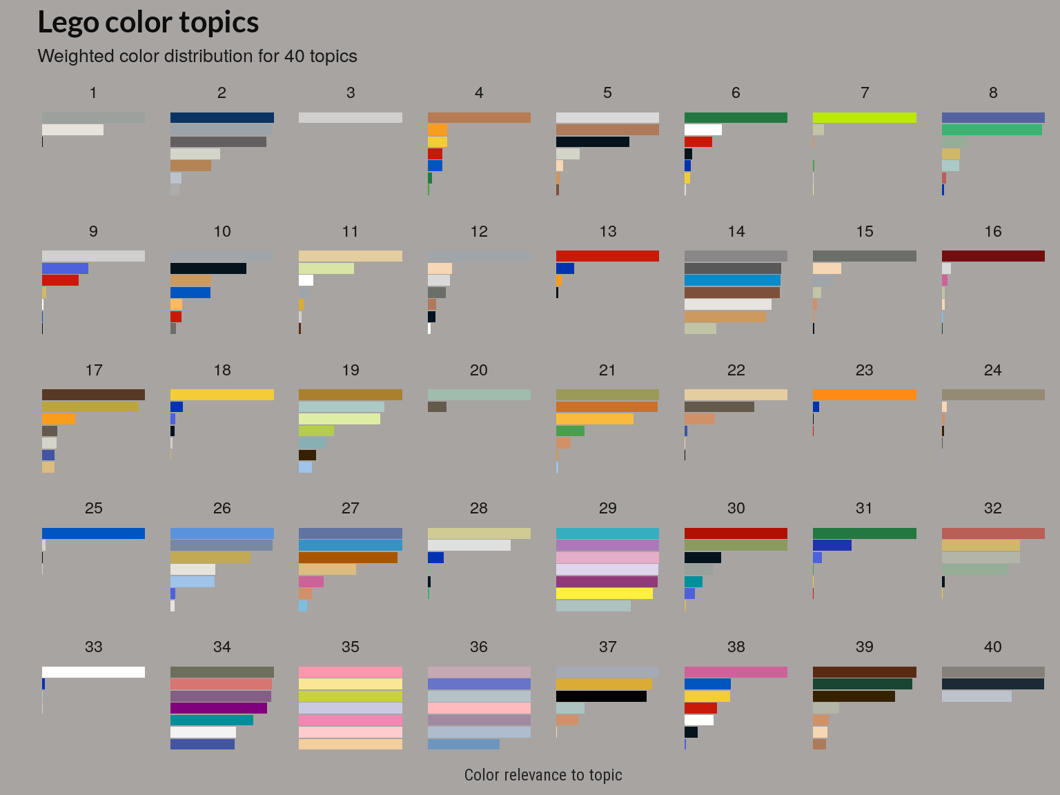
The above plot is based on the beta matrix, which gives the posterior distribution of words given a topic, . The above plot shows a weighted (or relevance) like that used in the LDAvis package.
How many themes?
Although there may be more topics that have few sets associated with them as we increase the number of topics, the coherence of a few topics appears to improve.
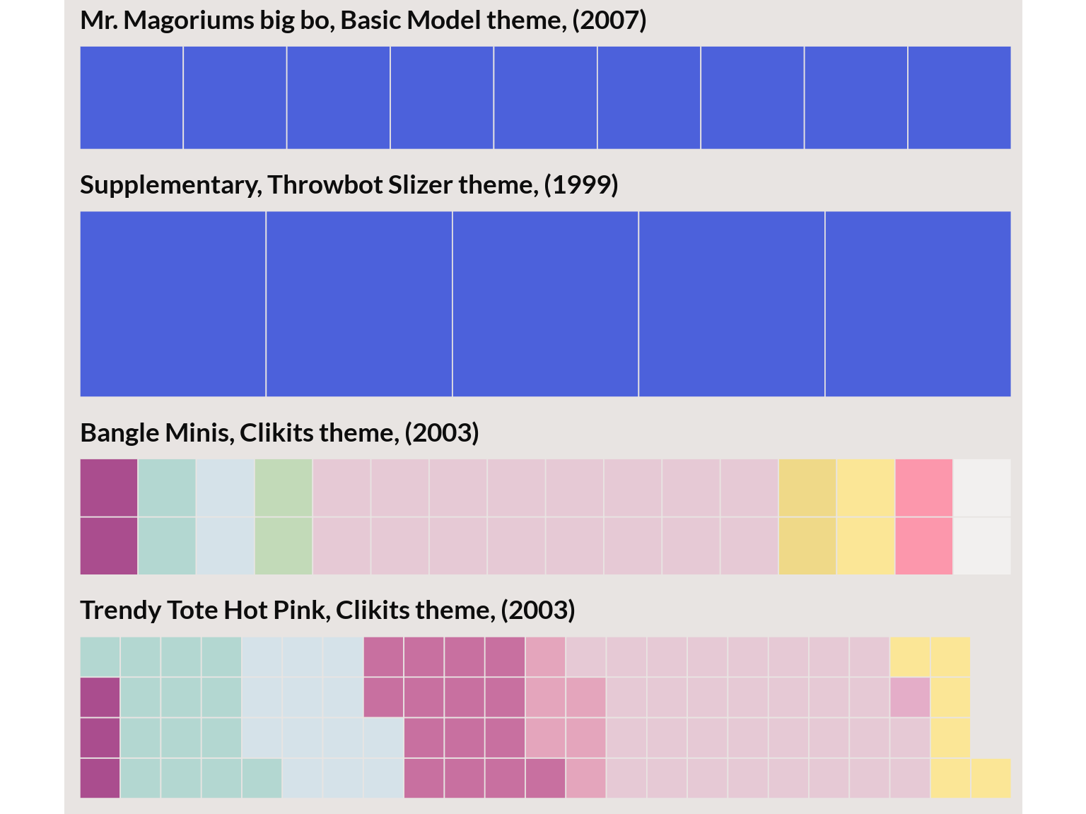
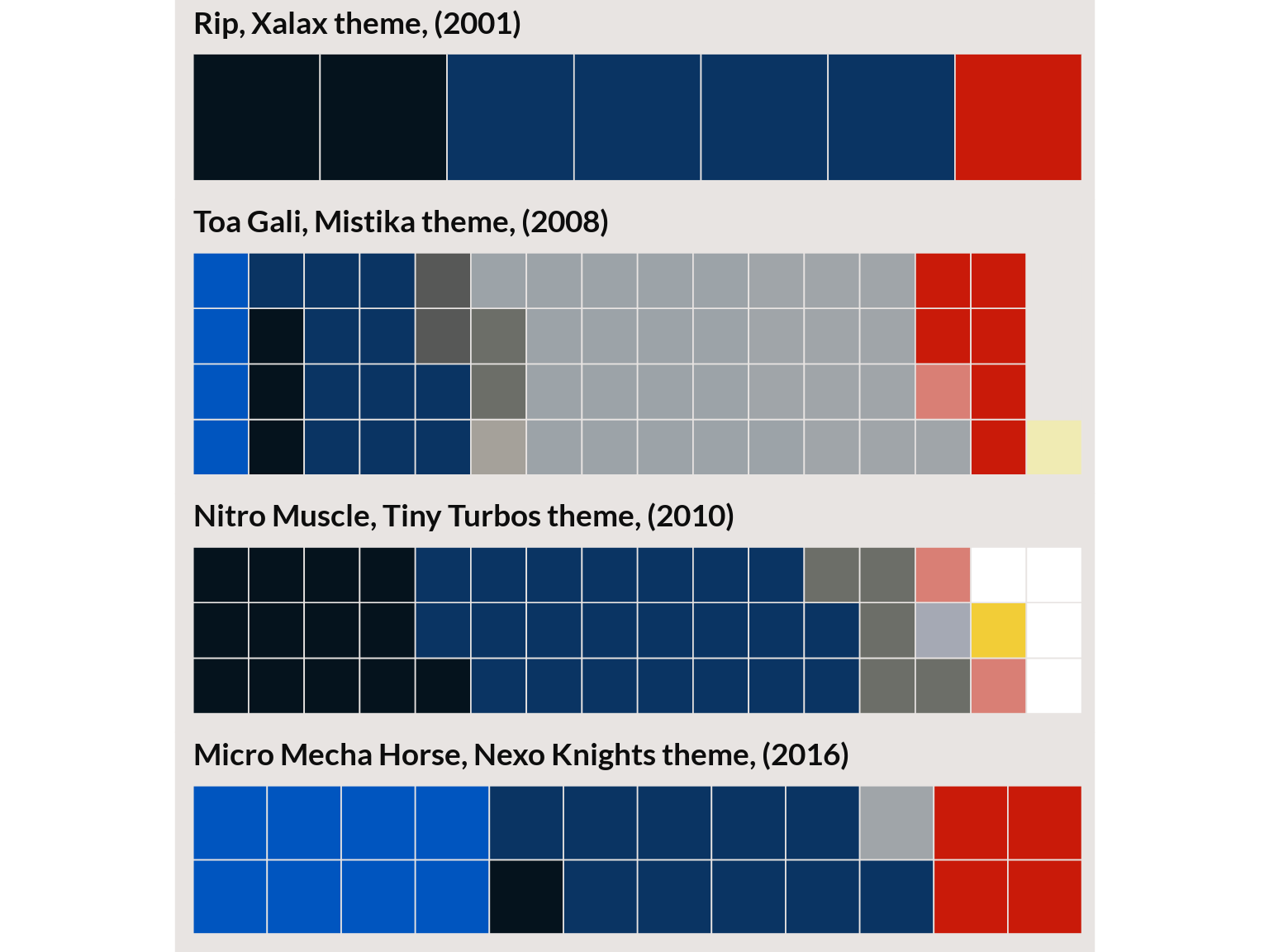
For example, the two plots below are selections from sets with the highest gamma, for each topic. When we go from 30 to 40 topics the top sets in the topic are removed by the remaining sets are more visually similar. (Also note that the sets that stayed had the top relevance score or weighted ).
Topic 2 from the 30 topic model
Topic 2 from 40 topic model
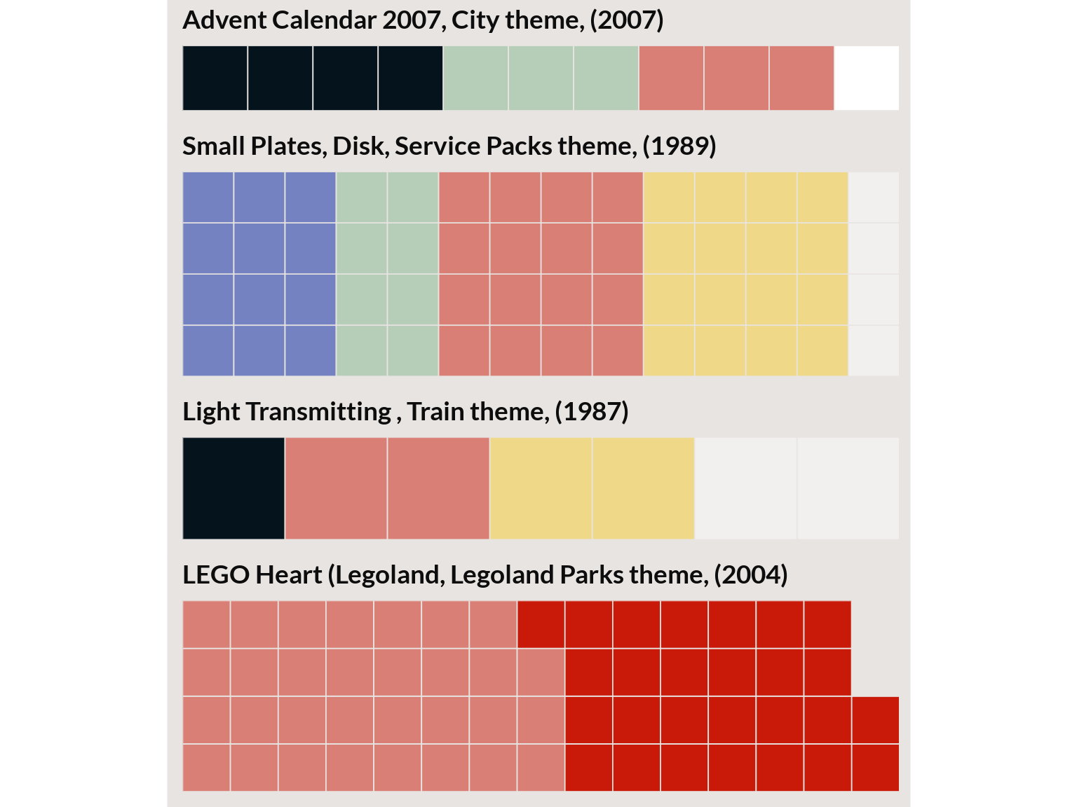
I’ll plot one more topic from the 40 topic model that looked ‘suspicious’ but a sampling of the top sets seem to go well together.
Topic 32 from 40 topic model
Evaluation summary
Of the automated scoring methods, the perplexity scores and the distribution of topics over term probabilities were the only two that seemed readily interpretable and matched my personal sense of which model best identified coherent color themes. I ran the same scores on a small samples of the data for this Kaggle notebook and the coherence score consistently pointed at models with fewer topics. It might be interesting to see how evaluation methods vary with parameters of the dataset like vocabulary size, variation in document size and the number of documents.
LEGO color themes
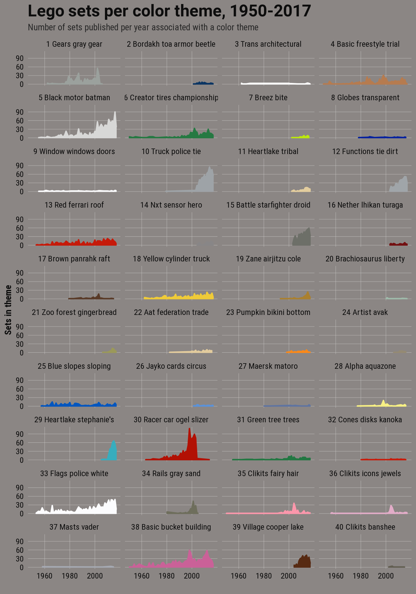
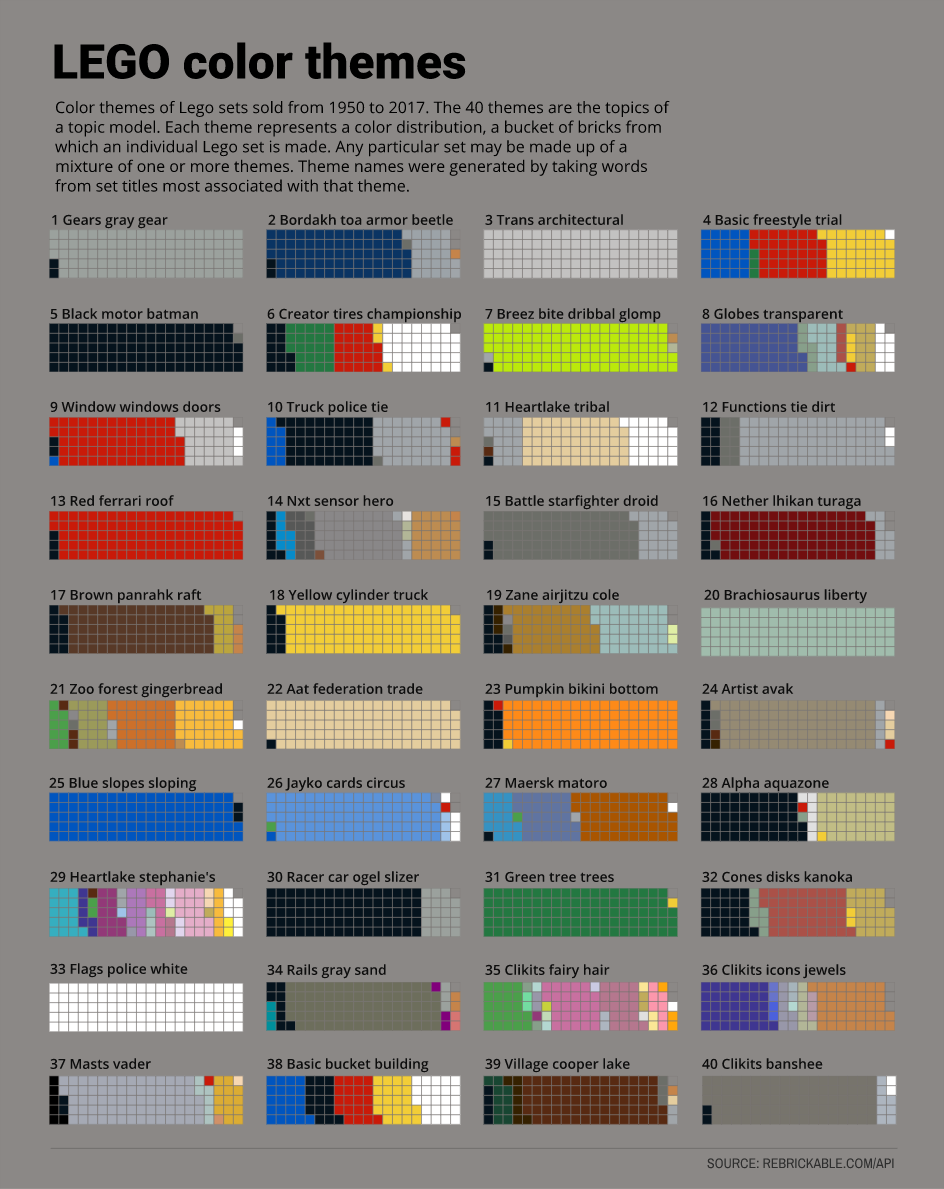
For the final model, I used the 40 topic model. Although LDA models the LEGO sets as mixtures of topics or themes, for the next two charts I assigned each set to a single topic using the same method that I used for clustering. And topics are a mixture of colors but I chose a color to represent each topic by blending the topic’s two most important color terms.
In the last plot, the topics are represented by color probabilities of that topic: 1 brick represents roughly 1% of the distribution.
